Pantone’s Colour of The Year 2013 is as enduring as it’s ever been. I always think of the Emerald City in the Wizard of Oz and the rich, vibrant, luxurious colour that is Emerald. Not green, not moss, not even British Racing Green…but enigmatic and mysterious EMERALD!
It’s a colour that expects attention but that doesn’t mean it needs to be the predominate colour in your interior palette. In Emerald Interiors you’ll see ways to add a little or add a lot, on your walls, in your textiles or through homewares. So please join me on this joyous adventure to discover the delights and richness of incorporating emerald in your home.

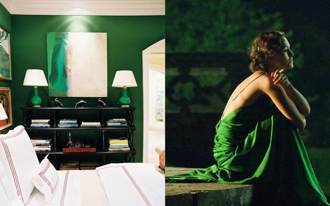
Dress by Jenny Packham
As a fashion colour, emerald totally rocks so it’s no wonder interior designers are incorporating emerald interiors for virtually any room in the house. Emerald is a colour of luxury, prosperity and wealth and its jewel tones are rich and elegant. Emerald is a great colour with which to break the rules – consider a stunning emerald splashback in a kitchen, enveloped around your bathroom walls or as a stunning feature in a bedroom.

Interiors found on Houzz.com.au
If you are thinking about emerald interiors, grab a colour chart and have a look at the tonal variations. Kiera Knightly’s dress in ‘Atonement. is a true rich emerald that reeks of luxury but, for her, also regret and reflection. These Pantone colours are along the emerald colour-line and vary from pale & minty to rich a& decadent. If you read my articles on three simple rules for adding colour or the Ten Commandments of Colour you will have see how to put complementary colours together. Colours that are opposite on the colour wheel can be put together for dynamic decor; like emerald and orange.

Interior by Miles Redd

When creating emerald interiors, consider the final effect you wish to achieve. Emerald is a ‘cool’ colour so you do need to mix in some warmth. Remember the 60/30/10 rule – 60% main colour, 30% secondary colour, 10% accent colour. In the images below, the top bedrooms have used emerald as the 60% colour with white 30% and black 10%. Whereas, the bottom three images have used emerald as the 10% accent colour – and the effects are no less stunning. I just LOVE the emerald carpet on the stairs.


White is a great foil for emerald interiors because it allows emerald to be the hero. When considering how to us emerald, and remembering the 60/30/10 rule, emerald and white is fresh & restful but with a vibrancy. To add interest without looking ‘overdone’ pull back with tones of brown or black. Wooden floors, gold accessories (such as a mirror), black trims, and natural wood furniture add elegance to emerald interiors.

Interiors found on Houzz.com.au

Interiors found on Houzz.com.au

Vibrant pink is an unexpected punch to emerald interiors and looks incredible. You can add equal amounts fo emerald and pink if they are of the same strength. Otherwise use a strong pink to complement emerald and take luxe-look interiors to a new and interesting level. In the images below, hot pink is added by way of a picture, cushions and flowers. Flowers are actually a great way to add a punch without it being permanent. So you can play around with accent colours depending on your mood.


You can also add emerald by way of homewares; crockery, nappery, cutlery, serving ware and glasses. Try brands such as Salt&Pepper, Noritake, and Villeroy & Boch, for quality retailers I personally recommend. If you have natural wood outdoor furniture, then emerald accessories look fabulous. They also look great on a crisp, white tablecloth.


Don’t be afraid of emerald interiors. Think luxury, elegance, richness and prosperity. You can easily add emerald, a little or a lot. The 60/30/10 rule will help you to decide, plus inspiration from these fabulous images. And to help you out further, read simple tips for adding colour and Ten Commandments of Colour conveniently put together by Taubman’s Paint.
Add to your emerald interiors with Aura textiles, a colourful throw or something more luxurious.


Emerald and all hues of green are my colours! Emerald and white/silver are my favourite combinations. I’ve always found it hard to incorporate the boldness into everyday situations, but these tips really help. Thanks for sharing Don’t Call Me Penny!
I love those colors toeghter definitely has me dreaming of the warmer weather of spring. (Although we have some time to go up here in the PNW, I’m afraid!) Thanks so much for visiting my blog this week! I’m really happy to meet you here on the Internet.
Thanks Luisa, yes – that emerald is GORGEOUS isn’t it. So glad you like the post. Thanks for visiting. See you ‘on the net’ 🙂