We are surrounded by colour yet many people seem afraid of it. By that I mean, when it comes to using colour in our homes, we play it safe. Why? Oh, don’t give me that rubbish about improving the re-sale value with neutral decor! Sorry, I don’t buy that – and I’ll tell you why.
Colour adds vibrancy, it makes us feel good – and unless you are specifically renovating ONLY to sell immediately, then you have to live with your choices. Even the word ‘bland’ sounds BLAH! Don’t get me wrong, I like neutral walls that make art and furniture POP! Adding vibe to your home doesn’t mean glorious technicolour for colour’s sake. No, it means blending, sculpting, complementing, drawing in the viewer with beauty. Sigh.

Image courtesy of Rachel Rieder Interiors
So, do you need simple tips for understanding and using colour? Probably. Can I help you with that? Definitely! One of the easiest ways to understand is colour is to familiarise yourself with the colour wheel.

Level One – Primary Colours – red, blue, yellow – all our colours are here.
Level Two – Secondary Colours – in equal parts, add 2 x primary colours to get a secondary colour. Yellow + Blue = Green. Blue + Red = Violet.
Level Three – Tertiary Colours – mix one primary colour with one secondary colour to create a tertiary colour. Yellow (primary) + Green (secondary) = Apple Green (tertiary).
Neutral – sometimes called ‘uncolours’ black and white are renowned neutrals. White enlivens other colours whilst black strengthens and stabilises other colours. Neutrals – including beige, brows and greys – provide backdrops and play nice with most other hues.

Image courtesy of Highgate House Interior Design
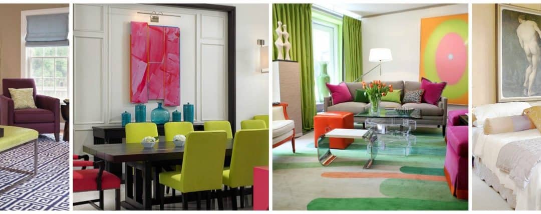
Complementary Colours – these colours are opposite each other on the colour wheel and add visual dynamism when put together ie: Green & Red or Purple & Yellow. As the above decor shows, orange and blue are opposite on the colour wheel, so work well together for adding vibe to your home.
Colours are also grouped according to whether they are ‘warm’ or ‘cold’. Warm colours include red, orange, yellow, etc. Cool colours include blue, green, etc. Professionals are very adept at using a colour wheel, and so can you.
There are three very easy tips on colour to easily add vibe to your home.
1. Don’t decorate ONLY with warm colours or cool colours (unless you are looking for a very specific outcome). Let one colour dominate then add complementary colours and neutrals.

Image courtesy of Kathleen Boyd Interiors

Image courtesy of Suzette Sherman Design
When you pick a main colour, use it three times in the room. In the bedroom above the orange has been used on the wall, for the bean bag and also the window seat cushion.
2. Use balance and contrast. Create contrast by using colors that are opposite on the colour wheel. Create balance by using them in the same intensity. However, do choose just ONE to be the star and use neutrals to create ‘landing spots’.

Image courtesy of John David Edison Interior Design
It may seem obvious, but look in your wardrobe for clues as to the colours you love. If you love fashion style then you may also love to live with those colours in your interiors. Just use the tips here to incorporate them successfully into your decor.

Image courtesy of Susan Diana Harris Interior Design
Beloved objects are another way to choose interior colours. It could be a brightly painted jug, the colours in your favourite flowers or even scented candle hues.

Image courtesy of Peggy Braswell Interior Design

Image courtesy of Highgate House Interiors
If your beloved object is a rug, let it be the hero piece allowing it to stand out with neutrals.
3. Love they neighbour. Consult the colour wheel and see which side-by-side colours appeal to you. The reason they look good together is because they are ‘related’ colours. Use your favourite colour and then add two neighbouring hues. When adding vibe to your home, vary the intensities f the neighbouring colours.

Image courtesy of TruexCullens Architecture

Image courtesy of GM Construction
Using cool colours does give a sense of relaxation and serenity, which is why they are often chosen for bathrooms and outdoor areas. using wood accents ‘warms’ up the cool hues.
With the above three easy tips, you can tackle almost any colour situation. However, some more tips include;
– choosing a ‘Hero Piece’ and decorate to that – could be a rug, painting or furniture; usually it’s the biggest, most interesting or most attention-seeking piece in the room.

Images courtesy of Kristen Rivoli and Stephanie Bateman Photography
– don’t choose ‘matchy-matchy’ bedlinen. For a chic and stylish look choose a predominant colour then add in complementary accessories, textures and patterns. For best result, vary the pattern sizes.
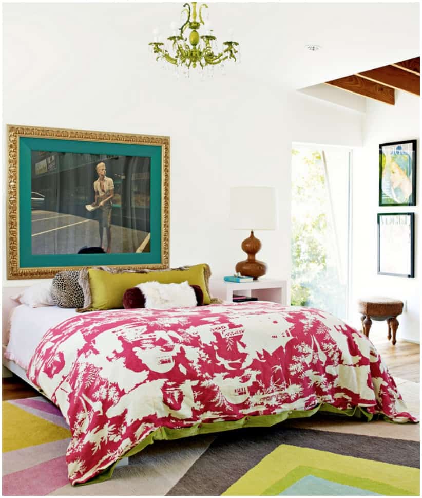
Image courtesy of Kristen Rivoli and Stephanie Bateman Photography
– if you do love a neutral decor, add some interest with a pop of bold colour, such as the orange below. This room is lacks being boring with the use of patterns and gorgeous pops of bright orange.

Images courtesy of Tobi Fairley Interior Design
– don’t be afraid of using black. Black or very dark walls recede into the background allowing other features to surface.

Image courtesy of Lisa Borgnes Giramonti

Image courtesy of Anna Lattimore Interior Design
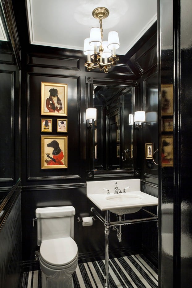
Image courtesy of Architecture Ofer Wolberger
– use wallpaper for a feature wall or to add interest to a small space

Image courtesy of Diana Bergeron Interiors

Image courtesy of Todd Davis Architecture
– don’t forget exterior spaces – when adding vibe to your home go back to the colour wheel. Small spaces respond well to vibrant, complementary colours.

Outdoor design courtesy of Carol Montoto
Have you got more confidence now? Have you added colour to your home with great success? What were some of the challenges? What would you do differently?


Trackbacks/Pingbacks